Over my years in recruitment, one of 3 things normally happens when we introduce data.
- We panic! Data means KPIs, KPIs are bad right? For many recruiters, KPIs mean micromanagement and the chance to fail.
- We fall asleep…zzzzzzz numbers can intimidating, confusing and the perfect opportunity for us to switch off and start planning how we are gonna spend the commission cheque from that candidate we just got off the phone with.
- It changes the way we see a problem forever.
You are 84% more likely to convince someone of your point if you include a %
Ok, that may not be true… I made it up but the point is solid: when used properly data can make your point clear, overcome any objections and get you exactly what you want.
However, there are a few rules to ensure you don’t cause panic or snoring.
- Be proactive – Get ahead of any problems or objections. The one example I always use I have shamelessly stolen from an old boss who had a simple phrase “4 interviews mean placement!” It’s a ratio I have used for many years so when I have the month where perhaps the offer I was hoping for hadn’t arrived yet I could point to the fact I had 4 interviews booked in for one role so could expect an offer to come really reassured any managers/clients and got me out of a lot of potential micromanagement.
- Be Concise – I have fallen foul of this one on more than one occasion. I am a numbers person, numbers make sense to me and I have been known to add extra figures or graphs where they aren’t necessary and I can see the moment I have lost people in presentations.

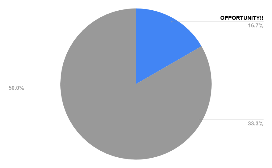
- Be Clear – Make sure the data you show is clearly presented, avoid pie and bar charts that have more than 10 data points as it can look beyond messy and rather trippy, know when to use linear and when to use logarithmic scales. (Hint: it’s any time you compare any other company to google)

- Be interactive – take questions, let your audience interrupt you be that a hiring manager or a webinar. You have nothing to hide, numbers don’t lie, be confident in what you are presenting and think that the questions help you bring the audience along with you. Tools like data studio can allow you to make data interactive so you can break down figures even more if you get questions.
- Use colour to maximal effect – in a sea of black text a bright colourful chart can break things up brilliantly and really set a point of emphasis for a key takeaway or something that you cannot afford to be missed.
- Have action points and takeaways – The most consistent bit of feedback I got when presenting was that the data is interesting but what do I do with it? So now takeaways and action points are what I focus on. If you need help with this I suggest starting from the end of your presentation, begin with the findings and takeaways (although be sure to change them if the data doesn’t support them). And be sure after you present numbers to follow up to make sure the action points are followed.
Well, that’s your lot for today I hope this helps next time you need to present data.

Great points. Smart and effective.
LikeLike